My partner's mom, age 94, got new hearing aids and the app that can control them (adjust focus on front/side/back, high/low/midrange, etc), runs only on iOS. We got her an iPad mini and I set it up so she can (A) read the Washington Post, (B) read a poetry app, (C) control her hearing aids, and (D) not much else (so as not to be confusing).
Much to my surprise, the hearing aid app does not adjust it's font size per the iOS system settings, and it does not have any font adjustment of it's own. It also has a background picture that interferes with focusing on controls. I'm boggled that a company producing a product for those with hearing-impairment doesn't recognize that many of it's users may be in age-related decline, and that can include vision and cognitive impairment.
Most likely the app was written by a third-party contractor who didn't know much about who the users are, they only received the requirements (app must do X and Y) and delivered.
I’ll be making my suggestions to the hearing aid company who sells the devices and the app. If there is any response at all, I expect it will be congenial. However, I doubt it will be resolved quickly since even non-invasive medical devices like hearing aids have rigorous and time-consuming reviews.
The trend towards lack of physical controls in cars is absolutely bonkers. I'm gobsmacked anyone thinks the Tesla Model 3 is good design.
Same with desk phones. Anyone who deals with customers at a counter doesn't have time to constantly look at a touch screen for buttons that may or may not be there. Nothing like chucking muscle memory out the window in the name of aesthetics :p
Truck driver. Our in-truck communications/logging/gps terminals at this company are old-ish Qualcomm devices. About 1/3 of the controls are physical buttons, the rest are touch screen. Some screen output is duplicated with audio.
The newer devices that I've seen are all touch screen and I dread that day. I'd rather reach over with muscle memory and press a physical button, while looking at something else like THE F-ing ROAD!
Unfortunately I think it’s more about pricing as oppposed to better design paradigms. Replacing embedded system engineers with cheap java engineers? Yea that requires a screen.
Similar to capacitive touch panels on appliances. You'd think this sci-fi look is more expensive to make, but it's actually cheaper. The "buttons" have no moving parts.
"Similar to capacitive touch panels on appliances. You'd think this sci-fi look is more expensive to make, but it's actually cheaper."
This is correct and will drive style and purchasing decisions for the affluent in the future, if it isn't already.
A home full of wifi-connected "smart" appliances all (failing) to talk to one another will be a sign of poverty while a big hulking Traulsen[1] with no digital innards will (continue to) be a sign of wealth.
High end auto interior design, while currently dabbling with big silly (and obviously poorly designed) touchscreen interfaces, in an attempt to seem tesla-ish, will catch up as well.
I already have to look at the knobs in my car to see what I'm doing with them (or even find them in the first place). Is this true for anyone else? I'm reading this thread totally unable to understand what we are arguing about haha.
I don't think it's true for many others. The ability to operate a device without looking at the controls is one of the biggest features of old-school "dumb", physical controls. I guess you don't have to look at your feet to find the car pedals, or at your seat to find the gear lever and manual brake.
Temperature settings have famously bad controllers. I guess it's because they are new, and car designers didn't have time to compete on quality of those yet.
You can control the radio of any high-end 00's car without looking at the controls.
Back in the early 70s, before the energy _crisis_ when the speed limit had never been reduced below 70, everybody went 90 (and I passed everybody).
Auto air conditioning was a great luxury to have, especially in the deep south on a multi-hour tollway through wilderness with no exits for miles on either side of the pavement.
Of course gasoline was still commonly available with over 100 octane rating for prices less expensive than milk.
And most cars had a regular ordinary V8 engine.
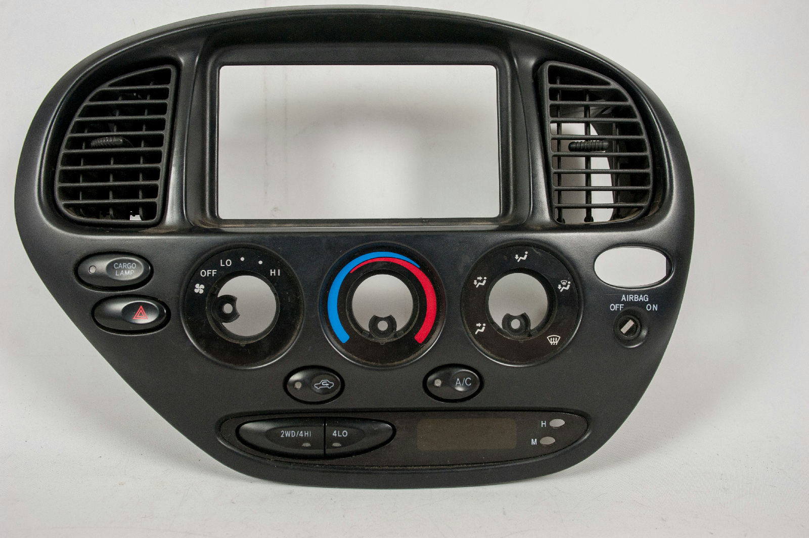
On the typical GM car, AC controls were like this:
Notice how there is only one sliding selector for all the main exclusive functions, each well separated physically and tactically and labeled well. Each company has almost the same identical functions arranged with a similar but not identical order and nomenclature. Regardless each company shows a logical spectrum of functions from left-to-right.
The other continuous slider is for temperature,
and a third slider on an opposing axis for the fan setting (closer to the driver when center-mounted) since that's the one you change most often. Other than the fan, the other settings often remain unchanged across multiple rides in the most ideal expected usage scenarios.
Obviously Max was quite popular with both Ford and GM, and it seems intuitively instinctive as the most cold you are going to get, but it's really just the Recirculate setting, while Norm is for Fresh outside air coming in across your cooling coils, which is what it says on the Ford.
All of this being fully documented in the handy owner's manual in the glove compartment, but even the least technically oriented people usually figured it all out quite easily on their own. Without even looking. If you did have to page through the book at least it was (much) faster than a PDF.
You could say there is very great similarity between both of these major competing control panels, or alternatively maybe there are only superficial differences in these co-operating engineering approaches.
The temperature can be completely set tactically across the entire range with no unanticipated discomfort, even though there is no thermostat, you are simply choosing across a continuous range of what is available under the prevailing environmental conditions.
Which therefore required occasional tweaking en route, on this type of early 70s fully-analog system this critical physical adjustment was most-often accomplished when needed by real-time fine-motor actuation under the direct control of _usually_ natural intelligence. Yeah, there was some total system latency, with largely unavoidable contributions from this type of hardware, but occasionally the intelligence level itself was not up to even average expectations which can add the most noticable deficiency. Some things never change.
On some Cadillacs there was an actual system thermostat handled transparently by the same control panel, and when "digital" there was a fancy numerical indicator but you didn't need to take your eyes off the road to set the temperature as exactly as you would like using the same control panel either.
Well, that's most of the cars on the road having AC, Chrysler/AMC was much smaller and most imports were Volkswagens (without AC) still concentrated in and nearby port cities where there were foreign-car dealers, parts, and mechanics having metric tools. If you drove a Volkswagen micro-bus across a number of states to get to Woodstock in 1969, during most of the trip there was no expected source of repair, tools, or supplies, even tires.
Out on the Turnpike they had some good pavement designed for 100mph along all arcs (even when iced over as often as _that_ happens in Florida) but the regular two-lane roads out in the middle of nowhere were quite wavy after decades of overweight citrus trailers and going 100 on them was like constant air turbulence. It made your voice wavy while the occasional semi was bouncing toward you at 80mph themself. Sometimes when you are in their lane passing one of them simultaneously. The approaching big truck required a certain amount of pavement on your side of the center line since the roads were built when semis were narrower and there was not a lot of traffic out there way back then anyway.
At least the cars were over-engineered for better structural integrity (using a slide rule), but were mostly less capable of precise handling compared to 21st century offerings.
But you really didn't want to take your eyes off the road.
Well that was when Moon landings were a regular occurrence too, so you have to figure at certain times in history you had to be a lot further above average to get very far in engineering or technical areas compared to today.
Even though technology has come a long way over the decades (and centuries) in some ways (in some places) average people themselves were more advanced then compared to now.
A lot more effort is needed to build _foolproof_ systems simply because there are a lot more fools and they are getting more determined than ever.
This of course can be confirmed by direct observation over the long term.
There is still no indication that less-than-natural intelligence will ever be an adequate substitute when performing difficult (but commonly expected) efforts like in the old days. Especially when the natural stuff is trending downward at an increasing rate itself.
Well, by late 90's and early 00's, designers where exploiting the all-electronic properties of radio systems so that the driver could operate them not only without looking, but also without taking the hands out of the wheel. Yet, those 70's temperature controls would still be as good as the state of the art.
There was evolution. But it only happened when manufacturers would lose market share if they didn't do something that doesn't suck.
By its turn, nowadays cars are making it so that drivers must take their eyes out of the road to even look at the fucking speed indicator. We have seen some incredibly quick technology loss.
It's just a physical interaction layer though. Is there a market for designing this interface in software graphically, getting the code working, then sending the emulated interface off to get physical copies shipped.
It comes as a device with a usb connector. You plug it in and it works just like the software emulation but as a physical object.
No EE or embedded people required. A cheap software person could do this
It's about the parts and assembly, not the engineering time. A couple million dollars of upfront cost is roughly irrelevant to the sticker price of a vehicle.
For a low volume car like the Model 3, $3 million is already down to ~$12...
I've given up. I use a set of stick-on bluetooth buttons to control everything but the volume in the my current car. I suspect I'll be using them for the volume too in my next car.
I own a Model 3 and I agree the interface for controlling simple/common actions such as wiper blades and temperature adjustments is terrible and dangerous. I often ask myself how older drivers can deal with it.
However, I do think the model 3 interface was heavily influenced by their self-driving ambitions. The technology hasn't caught up to the design yet, and it's a bit dangerous.
> Anyone who deals with customers at a counter doesn't have time to constantly look at a touch screen for buttons that may or may not be there. Nothing like chucking muscle memory out the window
Is this so? I used to work at a Dunkin Donuts, and the POS / register was entirely touchscreen, and I and everyone else developed muscle memory.
It's also very much a part of the hardware as a service paradigm. Control the interface, control the device. If my Tesla has a touch screen push button start, it is trivial to disallow me to drive until I update the car software and add in some tracking "features" or what have you.
I have a big clunky deskphone. I have yet to make or receive a call on it. The desk real estate it occupies is a bigger cost to me than however many seconds I can eventually save.
This is about things we actually use, and their bad usability when your senses decline with age.
If you really used that clunky phone, you'd appreciate how at hand it is, and how fast it is to use compared to a cell phone, specially when you desk calls are short.
A lot of things that are actually used are used rarely. Maybe I will use that phone eventually. Optimization should take rare/casual usage into account.
Thoughtless design is everywhere. My company uses Discord for comms and I’m active in several Discord communities, but my vision impaired co-worker isn’t. Not because of a lack of want, but because Discord has been coasting on accessible design for years. https://www.reddit.com/r/discordapp/comments/4tn00z/when_wil... Everything takes more resources than we expect, but surely a theme for their client (we do have some proof that it is theme-able) that is friendlier for screen readers shouldn’t take more time than an entire games store?
For me, the big takeaway from this article and companies like Discord is that people just don’t seem to care. And that’s often the status quo until an Apple comes along. We forget this, but back before the resurgence of Apple design was an afterthought, not a forethought even though there were obvious gains to be had and a better future to lead towards. But the vast majority of companies avoided the obvious win until Apple’s stock price shocked them into caring.
A significant fraction of everyone’s user base (including the core users) would benefit from accessible and thoughtful design, because like the article says, we’re all disabled sometimes. Now, we just need to figure out which company will have to show the world how to do it.
The dismal accessibility adoption on the web is horrendous, but working for a company that has to deliver accessible web apps to comply with Federal law has really opened my eyes to how terrible to ecosystem of accessibility is.
My team spends about a quarter of our time working strictly on accessibility, and we find ourselves straying from the beaten path often in order to accommodate a specific screenreader/OS combo. We run into situations all the time where we're unable to get insight from the docs because something is buried deep in the spec.
We also have to draw a line in the sand about which screenreaders to support and which ones to pass on, which pisses off clients that use screenreaders that we don't support.
Automated accessibility audit results sometimes contradict documentation around best practices, which can be frustrating.
The other thing I've learned is that developers usually hate working on accessibility issues because the screenreaders are much less intuitive to use and can really muck up your workflow if you're trying to ensure that an interface is completely accessible.
While I agree that we as a community can do better, I think that web accessibility in its current form is largely a failure because people see it as a cost that they're not interested in incurring, possibly because of the issues I've listed above.
Since website frameworks like Bootstrap are a thing, would it make sense to implement accessibility guidelines at that level, so that designers/people who don't know are encouraged to use sane defaults?
Or is it too content/layout specific?
Eg: I might like to roll my own static blog, but I don't know how to ensure that it is accessible.
I think making frameworks like bootstrap accessible-by-default is a great idea, but it won't be catch-all solution. A11y needs to be a conscious part of the design/development process, just like security.
One of the things we've learned is that much of the complex, dynamic UI things one can do with frameworks like React/Angular is really, really, really hard and frustrating to make fully accessible because people never design React components that are easy to use with a keyboard.
We live in this world where the capabilities of UIs for enabled people continue to grow at the cost of accessibility for the disabled. With the shift towards frontend frameworks, the problem needs to be addressed at the markup level IMO.
Yep, back in the day when BetterDiscord was a thing we'd be making CSS and some JS to change font sizes, change the color of icons for colorblindness IIRC, things like that. Discord's staff continually acted in bad faith about it, to the point of spreading outright lies about the program being malware. Was a big post going around all the public discords, few ever just popped into the betterdiscord server to simply see how that wasn't true. Also when the server got big enough Discord refused to allow more users, so it was continually broken to everyone. Crazy how wanting to change the chat background into doritos and help people was such an evil threat to them.
If you read the original C&D they clearly did not just want to stop use of the trademark (or if they did, they certainly claimed otherwise, and got the extension should down vs renamed). It's nice that they could be convinced otherwise, but they clearly complained about the nature of the extension, not just the name.
I characterize this as "all PMs have perfect eyes and skin". The first iteration of the Microsoft Surface featured a micro SD slot that was unusable if you had anything less than perfect, pliable finger nails. I cracked a nail so many times using that slot I gave up.
Current generation Apple designers clearly have amazing vision: part numbers on light grey on white in microscopic fonts.
At my employer (very large company) whose product is not an app (but our apps are used by a lot of our customers you don't have to) we do accessibility for our mobile apps and web, but only for sightless people, who rarely if ever use our apps due to the nature of our business. However the number of limited sight people, including older folks and those with visual limitations who can still see, are a large number of our app using customers; sadly we ignore them in design. I too have floaters and have trouble with low contrast text and our app designs are a bit hard to see. In a previous job our designers insisted on medium gray text on light gray backgrounds: I actually upped the contrast in my implementations from what was requested, and no one ever noticed thankfully.
Imagine if Uber did the same, support voiceover for their driver app (like why would a sightless person drive for Uber!) but ignore those with somewhat limited vision or are using the app in a fixed mount while driving, but are otherwise fine with driving vision.
The small fonts are a good point (so to speak). It can be hard to distinguish some letters from numbers, etc. on something like a Windows ID licensing code. Don't get me started on micro USB connectors...always with non-contrasting colors of course. God only knows how an elderly person deals with their CAPTCHA test o' the day.
My highly developed sense of old fartdom really comes out when dealing with modern cars with touchscreen displays.
I've had a lot of trouble entering the Windows serial numbers when installing Windows. The B and 8 look alike, ditto for O and 0. I've had to use a magnifying glass on it.
Apple's online documentation pages have also tended to be light grey fonts on white. My eyes would ache trying to read them. I find their choices baffling. It's like they were so focused on design they forgot about people simply wanting to read it.
1 and I / 5 and S are other ones that can be tricky. I'm surprised if Windows is still using them in serial codes - I thought that was something the shareware community had learned not to do years ago. Maybe some of this knowledge is getting lost.
I've had a lot of trouble entering the Windows serial numbers when installing Windows. The B and 8 look alike, ditto for O and 0. I've had to use a magnifying glass on it.
This kind of thing is a pet peeve of mine. So many codes require digits and letters these days -- why not just digits?! It would be so much more user friendly, especially when using a smartphone keyboard.
> Current generation Apple designers clearly have amazing vision: part numbers on light grey on white in microscopic fonts
Tip: take a photo and view it in the photo app on your phone or desktop. It is often much easier to read then. If it is not, it can often be made so by playing with the editing options.
This also often works with things like power bricks that sometimes have the specs "printed" in raised plastic with no coloring to distinguish it from the rest of the case.
Another similar trick: you can use the zoom feature to dim the screen below the normal threshold. Set the zoom level to zero and then set the zoom filter to low light. I use this as my triple click, and it's great for reading in absolute dark without ruining your night vision.
There's a "reduce white point" accessibility option specifically for this if you want finer control over how dim it goes. I use it if I ever need to look at my phone with a migraine.
This is no tip, this is something I guess everyone has ended doing out of necessity. I take a picture and max the contrast and zoom, but I shouldn't need to do that just because legible print is not fashionable.
Apple can be bad for this. Unfortunately the spindly little grey fonts floating in a sea of white or grey seems to be part of a broader design fashion at the moment. (Of course, I don't rule out that Apple played a role in kicking off this fashion.)
My current favourite example is the MDN page covering text contrast — https://developer.mozilla.org/en-US/docs/Web/Accessibility/U... — which violates the rules it states. (As does practically all of MDN, but particularly the confetti-factory code samples.)
> Current generation Apple designers clearly have amazing vision: part numbers on light grey on white in microscopic fonts.
OMG, this has to be the worse fashion decision they've made. Let's use this thin, tiny, light-grey font to write over the shiny white plastic. Fuck you Apple.
For some reason companies hate text now. Instead of a menu, you get icons with as minimalistic a design and as little difference between them as possible. Entering your user name and password is two separate pages for some reason now. Window borders have disappeared so instead of knowing at a glance where you can click and drag you have to closely watch your mouse pointer change. A big "Hewwo 2 U!" screen is added between turning your computer on and being able to enter your password as if you foolishly left your desktop in your jeans pocket and Windows wants to make sure you're not pocket-PowerPointing.
It's like they're trying to alienate everyone not intimately familiar with the system and appeal to the lowest common denominator at the same time.
I don't mean to defend the trend of using undecipherable icons with no text labels, but this is an example of how requirements can clash: internationalization.
Sometimes the text label that would fit in English is too long when properly translated to another language.
(Icons are problem too: they can be meaningless to an user. However, they have the benefit of a somewhat constrained size, unlike words and phrases.)
I personally prefer interfaces that scroll, like web pages, to interfaces with a fixed or partially fixed frame, like mobile apps. A fixed frame works when you can fit it in full in your screen; this was easier on a low-resolution but large display than on a very high resolution 4-6 inch display.
I for one like the material minimalistic menu items we get now. (Assuming they use standard material design icons) it makes it quickly recognisable and accessible.
If you use them constantly. For example, most of my Gmail use is on an android device, which has a radically different UI than the web mail. When I use the web mail, probably once a month or so, I have to use tool tips every time because I've forgotten which tiny grey on grey button is reply, which is spam, etc.
I'm 51 and work in tech. I now understand the nuances in this article. I'll probably understand them better as time goes on.
Young readers probably skimmed over the bits about floaters in the eyes. Everyone older than 50 gets it.
Young readers probably skimmed over the bit about frequency definition, captions etc. Everyone older than 50 gets it.
I don't get the bit with walking sticks yet, but I am not there yet. But I realise that.
I was young and bulletproof once - even up until 5 years ago I didn't understand what this article was about. I gather by reading the comments here that most don't. The challenge is explaining ageing to anyone under the age of about 45, when it is entirely out of their scope of experience, in a demographic who think they know it all. Ageism is embedded in our society, whose best attempt at inclusion and diversity is based on colour of skin and gender. I don't think it will change, it has probably been the same for thousands of years.
I had to go around to a friend of my mothers the other day - in her 70's, her younger relatives had switched off captions on her Samsung TV. She had no idea how to turn them back on. It is hidden about four layers deep in the fu.king menus. Why isn't it a button an on/off button on the remote? Another button amongst the 20 already there? In the manual - It got a paragraph mention about 30 pages in, in a tiny font. So discriminatory. I am seriously thinking of making a career of this, while I still can!!!
There is also the 'no bullshit' attitude that starts to emerge when you turn 40. You want product to do a thing. Not to engage you in any way.
You either already have a life or you know you will never have one.
Many older people have money and they are willing to spend it if does a thing and it's easy to get.
If Amazon would buy Paul Graham's old Viaweb code, it would need just little updating to become a tool that generates killer UI's for the aging population in the developing world. Plain html5 with commons sense and good defaults with tiniest amount of javascript is all you need for a well functioning web service. Incidentally Hacker News is not far from this ideal.
Yup. Sure, I like to tinker with things sometimes.
But I don't, for example, particularly appreciate spending half a day yak shaving with a computer just to get it to the state where I can actually use it for the task I actually set out to do.
About a year ago, I decided I should have a working Windows computer for games and the occasional other Windowsy thing I want to do. My first thought was to upgrade one of my home-built systems. Instead I ended up just buying a big laptop on sale because I more or less to myself that I know how to build computers. But I don't especially want to in this case. I just want a relatively compact computer I can use for some specific tasks.
> Ageism is embedded in our society, whose best attempt at inclusion and diversity is based on colour of skin and gender. I don't think it will change, it has probably been the same for thousands of years.
Typically, societies are gerontocracies; the aged run the show. Sometimes it's formalized, usually it's not. It's only in the modern Western time and place that we have begun to prioritize youth. Even in the USA, the country which is famed for idolizing youth, the old are in power and are the primary voters.
Is it just me, or do TVs have the WORST user experience of all tech? Somehow, they can get away with it.
I've always wanted a consumer electronics brand that was known specifically for usability. For commodity tech, like TVs, radios, monitors, music, I don't want the most impressive specs -- I want a brand that means "we will be easier to use than the other brands".
Choosing between Panasonic, Sony, LG, etc etc.. it's all meaningless. Give me a BRAND that says "easy-to-use".
I honestly don't find TVs that hard to use--but then I don't try to use "Smart TV" features, which are indeed pretty bad across the board. I mostly just use a Chromecast--a much underappreciated device--and my tablet or laptop. Hopefully Google doesn't discontinue it when they get bored in a year or two.
Young readers probably skimmed over the bits about floaters in the eyes. Everyone older than 50 gets it.
Jordan Peterson claimed in an interview with Joe Rogan, that his meat only diet got rid of his visual floaters, and that they are an autoimmune problem.
I question how much they are autoimmune, but I've never noticed anyone talking about getting rid of them, deliberately or as a side effect, before.
Any other anecdotes out there about this kind of thing?
I'm a technology enthusiast in my 40s. Even I lose my patience, to say nothing of people of my parents' generation, when I try to travel to a new country which has a different set of showers, cooking ranges and washing machines/dryers.
To say nothing of older people I've seen on flights who struggle to turn on their entertainment consoles.
Turning on a device should not be a puzzle-solving exercise. As Alan Kay said, "Simple things should be simple, complex things should be possible." Too often, the user interfaces make complex things doable, and simple things possible, with great effort.
(Also I don't know if this is a thing in design methodologies : I prefer if designers avoid having basic functionalities as a result of a sequence of steps, rather, I like to have them as separate top-level buttons)
> Also I don't know if this is a thing in design methodologies : I prefer if designers avoid having basic functionalities as a result of a sequence of steps, rather, I like to have them as separate top-level buttons
It is if you care about ergonomics - the rule is, the more frequent an action, the less key/mouse/fingerpresses it should take to invoke.
It is not if you only care to make it look pretty, good for the demo or to encite first-time users to subscribe to your SaaS.
I speculate whether this observation indicates that most of the chatter around "design" is signaling focused on appearing hip/trendy -- largely a branding effort overlaid on top of company goals, rather than an effort to think through actual user needs from the ground up. That would explain why so much of the focus is on fads.
It's more than that—it's peacock feathers. You do it to signal you have money to burn looking "modern". You'll even see people on HN complain that a site looks "old", sometimes—not bad, just old. Keeping up with trends signals you're doing well enough to keep your site from appearing old, so looking maintained and up-to-date.
I think it's related to how chain stores & restaurants look so much more polished these days, and completely re-design their logo and colors (repainting whole buildings) every few years. They didn't used to do that, and everything generally looked a lot less "slick" than it does now. All I can figure is a couple of them started doing it to differentiate themselves from smaller chains and mom-n-pop stores (that couldn't afford that crap) and the rest started doing it so they didn't look left behind. Such a waste.
There is a hive mind of designers, but one must follow this hive mind to remain relevant. It is actually the case that skeuomorphic design, all the rage less than a decade ago, would be a turnoff to users today. Now, could this be because people associate good design with successful new products, and those new products have happened to use a different UI mentality for no other reason than signaling to a design-minded minority? Perhaps. But those new products do indeed exist, and they have truly moved the goalposts. One must follow design trends or perish.
As usual, design is mostly universal. Besides issues of strength, there's actually not much here which is specific to age. These are design issues for all.
> Loud restaurants are torture. So, more and more, my wife and I select restaurants by their noise level rather than by their food quality. At home while watching TV, whether shows, streaming events, or movies, we always turn on the captions, which often block critical parts of the image. Even worse, when a film shows someone speaking in a foreign language, the film often translates the words, but so too does the closed captioning, and the two are placed on top of one another, making both attempts to help the viewer completely unhelpful.
I'm (only) in my 30's and every one of these applies to me and my friends, as well.
One difficult thing to grapple with here though is that my impression of the elderly is that the bulk of them are living on a tight budget to make sure that their retirement savings last them through their remaining years. Well designed, hip and beautiful products typically come at a hefty premium (think Apple tax). How many elderly people are willing to pay a premium for good, user friendly design?
Could it be that the reason we don't see better design for the elderly is because most of them are unwilling or unable to pay extra for it, unlike the young?
I've upvoted this - I made desktop graphics software that I thought would be used by young web designers, but ended up being popular with a 60+ older demographic. (Think along the lines of "scrapbooking".)
They're wonderful people, but there was a lot of pressure to keep prices down because "I'm on a fixed income". That makes it harder to invest more time in design, even though you need to since they're your main market.
(I'm even aware of a couple of elderly 'customers' where "my son gets me all the software for free!", nudge wink torrents.)
Elderly users often require a lot more customer support and hand-holding than a customer in their 30s. Some really enjoy the customer support since for many of them it's one of their few social interactions of the day. Which is fine, but if the product also has to be cheap to meet a fixed income, it's hard to be profitable and have great design and excellent non-rushed non-offshored customer service.
Of course, not all customers are the same. I'm sure there were wealthy & savvy elderly customers too, but I didn't know how many because they never contacted customer support & so I never got to know them personally.
I don't think it's an affordability thing so much as perceived value. People will probably fixate on the products that they wanted at some impressionable age. It's a lot easier for me (being an old guy) to buy expensive stereo equipment even now than it would be to buy a $1000 cell phone.
The difference is that college students expect to make more money in the future so they don’t put any thought into stretching their dollar. Retirees are the opposite. They may have bigger bank accounts, but for most of them, they know that’s all they’ll ever get.
When we talk about substantiveness, what we mean is that we want commenters to post information that has a reasonable trail back to our shared reality (another commenter here sometimes uses the phrase “connect the dots”). Anecdotes can be interesting and valuable, but they don't form a basis for such broad claims as you've made. So if you want to share an anecdote just share the anecdote, and if you want to make a claim please back it up with substantial evidence—and do so with consideration.
The article makes some good points about not talking down to older people, but here's the thing the article misses: aspiration. Advertisers test all sorts of messaging before they roll out a large campaign, if empowered old people sold units we would already see more of them in ads. Advertising is largely playing on the target audiences emotions, selling them an idealized form of themselves if only they brought X product.
Old people dont aspire to be old. They are, for the most part, quite happy to buy products fronted by younger people who remind them of their younger selves. So the missing grey dollar goldrush this article bemones is largely already being served, and its worth considering that most ads must simultaneously reach multiple demographics, would you aspire to drink old lady coke?
The Coke ads currently in Australia (and apparently from the UK) feature an elderly man trying a Coke No Sugar for the first time, who then goes on to ask "What else haven't I tried?" and tick off a bucket list while Queen's "I Want To Break Free" plays in the background. There's absolutely ways to do it if you want to.
There are some places where this is going well, such as the firefox reading pane. Nearly every article can be switched to the pane, and you can choose the font size and readability. (Sepia is high contrast, but easy on the eyes.) I'm glad this is being brought up, and I love the tone of article, too. What's merely annoying for me right now (I'm in my mid-30s) will be untenable when I'm 65. Design can be better.
The other alternative, of course, is to opt out of some of this technology. iPhones aren't great for the elderly? Well, dumbphones are making a small comeback and are much easier to use.
I've read this book three or four times and it's kind of crazy he was at Apple as an executive and had no lasting impact, iOS is now full of hidden gestures/features with low discoverability/intuitiveness. Nobody there with the power to make decisions agrees with the basic premise of this book.
On the other hand, Donald Norman also came to embrace (and somewhat found) the idea of User Experience design. He pretty much admitted that his earlier focus on design was too narrow. And I'd argue that Apple very much likewise broadened their focus to the entire user experience.
For the increasing number of people who have cataract surgery, the eye’s lenses have ben replaced with plastic, which usually have a fixed focus. (Artificial lenses that can be focused are under development.)
My dad recently had cataract surgery and I just assumed he was getting would be a deformable lens that would give him the ability to focus again. Does anyone know why it is so hard to develop such a lens ? As far as medical breakthroughs it seems like low hanging fruit and most people over the age of 45 could benefit from such a surgery since that is the age at which our lenses begin to harden and can no longer be shaped by our ciliary muscles.
The lens is suspended by a ring of fibres about 1-2μm thick from the ciliar muscle. Getting accommodation to work with a synthetic lens would require a substitute suspension mechanism to attach the lens to the muscle. And it would probably be useful if it could be implanted without temporarily removing the front or the eye including the iris.
Compare that to a small cut to the side of the eye to extract the old lens and inject a new one that is held in place mechanically.
A glaring example of this is the Canada Revenue Agency. It asks 5 different security questions, you need to type in the answer to, before you can set up account.
The problems I observed my elderly father having is:
1) The website times out way too soon. Before my father could type up three answers it timed out. Each time he has to start from scratch.
2) An answer to security a question, like "who was your first teacher" Can have many variations.
Did he type in first and last name? Was the first name before the last name or the last name before the first name? Did he capitalize the letters? Did he spell the name correctly, its been many years. Did he make any typos.
I'm not even old and I hate security questions like this. I'll never forget the name of my best friend in 2nd grade, but I will forget whether I input his name as Billy Bob, Billy, William, William Robert, etc.
I'd say in a typical list of security questions I would consistently answer maybe a third of them (and those are mostly ones that a determined scammer could find the answers to). And that's assuming that the service is forgiving in terms of abbreviations, spelling variants, the presence of words like Road, etc.
The worst I saw recently was a mandatory security question about "What was the first city you visited?" The answer was multiple choice with about 6 city names.
The CRA website has had bad problems that go way beyond accessibility. I've experienced inscrutable instructions, pages that contradict each other, and security procedures that get stuck in infinite loops.
My theory on this is that it is easier for designers to empathize with users who are the same age or younger, since in these situations they've had the experience of the user's age, whereas very few designers have had the experience of being old (save for the author of TFA).
It's hard to empathize with abstract people, you need to observe and engage actual people in their environment, which costs time and money. Too often people are stuck in a conference room talking about personas. I've ended up frustrated at clients telling them "you are not your customers" endless times.
It's amazing how much you learn getting out and talking to customers. One of my favorite examples is for a company that sold plumbing supplies to contractors. The biggest feedback was that these guys spent most of the day in a truck and needed to be able to place orders on their phones and they begged the team to make sure that all the buttons (and links) were much bigger so that their fat fingers could click on them: "this was designed by a pianist".
There's so many examples of interactions that show that the designer didn't understand what the end user is really trying to do. My bank makes me enter a first and last name for transfer recipients, but only use the last name on the confirmation step, however the bulk of my transfers are to family members!
Absolutely, it's that plus the fact that young designers and programmers crank out much more output. And they're cheap.
Myopia and hand aches give excellent perspective on the problems of accessibility in UI design. Alas, they also tend to limit my time with the machine and productivity in that time.
It's about the same how Reddit users' average age is purportedly twenty-something but the content and comments are dominated by teenagers. Teens just post way more.
Ultimately, accessibility for the elderly is a typical case where one has to invest additional effort by choice and principle. I.e. not gonna happen under just the market forces.
I fear the effects of this are amplified by the current unfortunate trend of using dark pattern and strategic use of friction to steer the user into desired directions.
Congrats, your gray-on-white "decline" button that looks like a link is probably annoying for young and able-bodied users but it may be a serious obstacle for the others.
An issue I hit yesterday, I installed Chromium and I went in the Settings to disable the Google auto login, it did not work for me and I was very frustrated. After a few attempts I noticed that when you change the setting a small notification appears on the lower corner of the screen that I need to restart the program. Maybe that kind of notification is cool and slick (I don't think it is) but it is easy to miss for people like me with mad eyes (not sure if normal eyes can catch the notification if you are focusing on other corner of the screen)
I’m 33, my car had a touch screen display and the Bluetooth sync function is 3 clicks deep. If I were to start driving right away, it becomes a huge hassle to try to sync to Bluetooth. Doesn’t help that you can access the first 2 screens but the 3rd is locked since I’m driving. It’s as if some engineer somewhere thought the 3rd screen is more distracting than the first 2. I always imagine how easy it would be to have a physical button I can just click any time. Ahh the days of modern design... gotta love it.
I like his criticism of difficulty in iPhone screen navigation, My Dad is 97 and has to carry a tiny pointing device to get full use from his phone. He is much better using his iPad, but neither small device is natural for him like using his Mac Desktop Pro or his iMac. When using his computers, the full size keyboards and wireless mice work really well for him. Norman’s suggestions for iPhone navigation would help my Dad a lot.
> Even worse, when a film shows someone speaking in a foreign language, the film often translates the words, but so too does the closed captioning, and the two are placed on top of one another, making both attempts to help the viewer completely unhelpful.
This drives me nuts. Especially when the closed captioning blocks the film's translation with something completely unhelpful like (speaking foreign language) Why even bother putting that in there?
> As a result, even a manual is not enough: all the arbitrary gestures that control tablets, phones, and computers have to be memorized. Everything has to be memorized.
If they’re documented at all. I only discovered the difference in iOS between a “long press” and “hard press” on the touchscreen by accident. The extra useability thrilled me, but I wish the feature were better documented.
I'm hoping one of the big tech companies will invest into creating an inclusive design language that is accessible, functional and sexy from the get-go.
Beyond uBlock Origin for the abusive parts, I've also recently started to use Stylus to fix bad design of sites I visit frequently. Few minutes with browser's Inspector and I can usually whip up a little bit of CSS that removes unnecessary whitespace, UI trinkets, and densifies the site by factor of 2 to 5.
I wouldn’t recommend 1Blocker. I had it and was disappointed at how they rarely (if ever?) update their filter lists (they’re also not using the standard lists like EasyList).
AdGuard Pro is much better and supports standard lists like EasyList and Fanboy’s lists, along with region-specific lists and DNS-based blocking (so blocks ads/cancer in non-browser contexts too).
I’ve been using 1Blocker for a long time since back when there where few choices and it was clearly the best option. I like that it syncs with my desktop and use it with Safari on macOS too. I also like that it’s easy to whitelist sites, that it’s easy to block elements of specific sites, and that it’s an indie app.
I think the reason for not using the full EasyList is that Safari limits the number of content blocker rules to 50k, less than can accommodate the full EasyList. I wonder how AGP gets around that.
In any case, I rarely see ads with 1Blocker. The one thing it doesn’t block reliably is ad blocker detection, but I’m not sure that’s even possible for a Safari content blocker to do.
Looking at the App Store, I see there are a lot of blockers now. How did you decide on AGP over the others?
For me the main reason has been EasyList support instead of some kind of home brew list (they’re pretty much always based on EasyList anyway, but with a homebrew list you explicitly rely on the developer updating that list).
Please don't post nasty generalizations about large groups of people to HN. It isn't kind, and it is flamebait. What we want on HN is exactly the opposite. Would you please review the site guidelines and take them to heart? We've had to warn you many times, and the last time we unbanned you you promised not to do this.
I didn’t down vote you, but you really misunderstand old people. As I mentioned in another comment, my 97 year old Dad (almost 98!) uses computers and he has taught himself 3D animation, has started to write scripts, makes little movies blending real video and video with CGI added, and helps make biography documentaries for his friends’ families. He also goes out three or four nights a week to dinner, plays, movies, the local MIT club entrepreneur talks, etc., etc. Most of my Dad’s friends are similar: physically frail, but still have curiosity and zest for life.
Also, there should be no stigma for growing old. We all grow old and eventually die. Very natural thing. What we can do is to enjoy every day and be kind and loving to other people, looking more for what you can do for them than what you can get out of them.
Very awesome story. But doesn't this prove the GP's point then? Not all old people are incapable of figuring things out --by your anecdote-- and the GP's point is that the ones that are, have just lost their patience and perseverance for that stuff, not that they actually are incapable of finding a menu item because they're old now. And things requiring a bit of patience isn't discrimination, it's just that some things require patience. There are young people that act like this too, where they refuse to even look through menus for a bit or try different buttons, and we don't say computers are discriminatory against young people?
Granted we should most definitely still have accessibility features. Not having captions or bigger font options is pretty discriminatory.
Well, there are things that require patience and perseverance because they're complex. And they're things that require patience and perseverance because they're designed poorly. It seems to me perfectly rational to come to the realization with age that life really is too short to put up with poorly-designed devices and services. There are perhaps not enough devices and services that are well-designed but they're out there.
As a coder, service architect and security person for many years, I don’t mind when things get very complex.
I’m also a guitar player. When I play music, I want an amplifier with a few simple hardware knobs and not a digital gadget with a zillion nested menu options.
Basic functionality should be up front and clear, so people can get on with the thing they’re focusing on without getting hopelessly distracted. It is here that many digital interfaces fail, and not just for old people only.
If you’re ‘nearly 30’ then it’s likely you grow up with modern gadgets, and since you are on HN there is a higher chance that you have a stronger than average interest in electronics. Your parents did not grow up like you. They grew up in a time when a few knobs is all you need to operate a home appliance. And they are probably more interested in what’s being played on TV, rather than the TV itself.
The complexity of today’s electronics and softwares is getting out of control. If you have to actively explore all menus in order to use something normally, then I suspect the UI is poorly designed. But there is no incentive for their designers to improve, unless they acknowledge that their perception of electronics is very different from the average users.
> The complexity of today’s electronics and softwares is getting out of control.
I saw this illustrated in motorcycle dashboards a few weeks ago. I have a nice analogue speedometer and tachometer, with a small digital display showing a couple of useful things like trip distance counter. Reset the trip counter by holding down one button on the dash.
My father just got the new model of essentially the same motorcycle, with an all-digital dash. Resetting the trip counter requires digging into a menu three to four levels deep, and as you say, it took us a while to explore and find the option, with some disbelief at the apparent step backward in usability.
This is just you being unable to understand what was said, because you have no context to understand. I'm a middle-aged tech nerd and I tell you, it's not what you think it is. This should surprise you and make you curious, not to make you refuse to accept the possibility that you are wrong.
BTW. More and more studies show that young generations are not magically learning to use IT because they have grown up with it. Digital illiteracy grows even among the young. They learn to use the minimum functionality in apps they use daily, but they have relatively little edge over old people when they are put in front of spreadsheet program, or anything specialized. You can see the apparent impatience and signs of learned helplessness in them too.
I hope you learn a little more empathy before your parents really need your help. I know old people with vastly more sense and patience than you're displaying, but who nevertheless struggle with many of the issues discussed.
I'm 33 and probably thought similar to the original thought at some point in my life. I've only grown sympathetic after seeing the transformation of my dad as he gets older. Without having to make sense of how a profoundly patient and caring man could slowly morph into a slightly short tempered form of himself, I would have never tried to rectify it.
I think the original comment actually unintentionally hit the core of it. The younger poster exalted imdomitability. A lot of people grow up enjoying and expect themselves to be technically, personally, and professionally indomitible. Any regression on those fronts is understandably infuriating.
I rest my case. You should be asking yourself why, do you see you don't understand their behaviour? Why do they behave differently in menus to you, don't condemn them because they do behave differently to you.
At the same time, and without condemnation, older people CAN learn to be more playful/exploratory and patient with tech. Yes, tech can and should be designed better. But if there were one or two tips that could be disseminated, to old and young (most youth are not tech savvy, actually):
1. If you can't seem to figure it out, you aren't alone (probably poor design)
2. Willingness to calmly "play around" and explore menus/options/buttons is THE KEY to getting almost anything to work
Most young people are also daft and impatient. There was one golden generation, say born in the 70s and 80s, who grew up with tech that encouraged tinkering and learning. Anyone older or younger than this didn’t get the opportunity.
Well, they're old. They're difficult and boring to talk to. Besides, they aren't going to buy enough of our stuff now or in the future. They aren't the long-term loyal customers we're trying to cultivate, because they're - ahem - old.
Much to my surprise, the hearing aid app does not adjust it's font size per the iOS system settings, and it does not have any font adjustment of it's own. It also has a background picture that interferes with focusing on controls. I'm boggled that a company producing a product for those with hearing-impairment doesn't recognize that many of it's users may be in age-related decline, and that can include vision and cognitive impairment.